Spark Sessions
Spark Sessions
Strategy, Branding & Imagery
About this work
With the recent rebrand of Spark Sessions, the brand has taken a powerful step forward, both visually and conceptually, towards an identity built on strength, energy and purpose. At the heart of this renewed brand story stands the cheetah, a symbol of speed, intensity and perfectly timed performance.
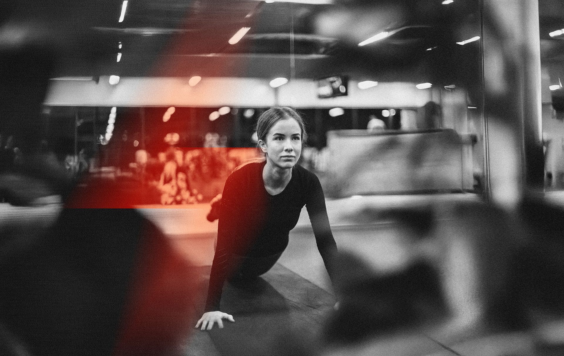
Just like a cheetah conserves its energy and releases it at exactly the right moment, Spark Sessions focuses on delivering maximum impact in minimal time. Through short yet highly effective EMS workouts, every second counts.
The cheetah represents everything the studio embodies: focus, drive and controlled power. It reinforces the high performance mindset of the brand and seamlessly connects to the concept of the training suits, where precision, intensity and timing come together to create a powerful and efficient workout experience.
By positioning the cheetah as the core of the brand, the rebrand captures a mindset of speed, focus and perfectly timed intensity.
The identity translates this energy into a bold and dynamic visual language built for high-performance impact.
By stripping the brand back to its core, the rebrand embraces a clean and minimal aesthetic that mirrors focus and control.
The refined visual language allows the power of the concept to speak for itself with clarity and confidence.